SELF Website Redesign
Reimagining a social enterprise’s website and brand
Company
SELF
Year
2024
Role
UX/UI Design, Web Design, Branding

Overview
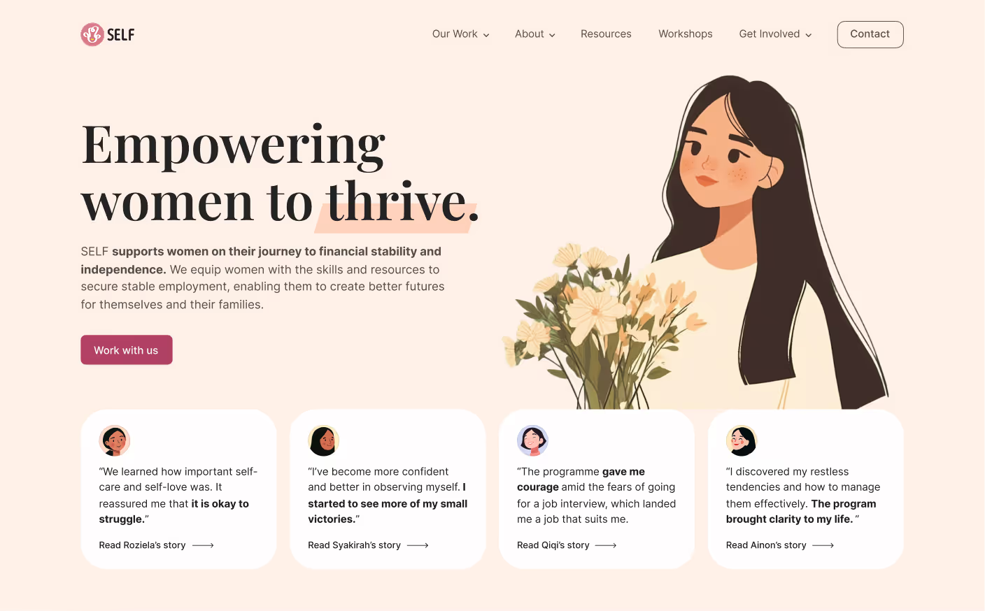
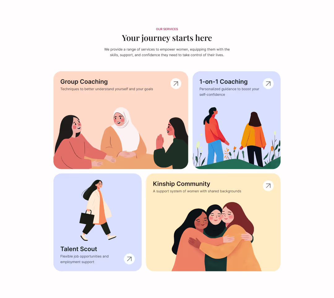
SELF is a Singapore-based social enterprise that helps low-income women build financial independence through coaching and community. They asked me to redesign their website to better showcase their work and reach more people.
Project Goals
1. Attract more business partners and clients
2. Strengthen SELF’s brand through compelling storytelling

Deliverables

Fully responsive 7-page website

CMS collections for easy client handoff

Targeted social media ads linking to the website

Custom illustrations and cohesive brand guidelines
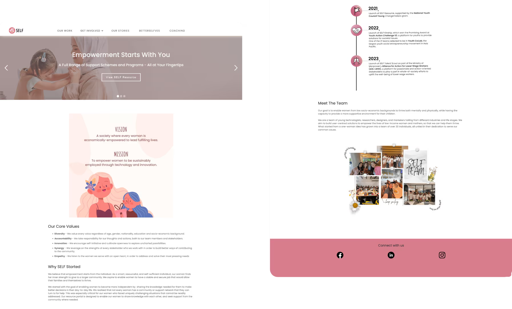
SELF's original homepage design
What Wasn't Working
I started off with a full website audit to uncover the key problems holding the site back.
Low conversions
Few people reached out about SELF’s services, partly because the language was unclear and the CTAs were hard to find.
Confusing navigation
Key information was buried in vague menus, making it difficult to understand what SELF offered.
Weak visuals
The site lacked visual appeal and was overwhelmed with text, which made it feel unprofessional and inconsistent as a brand.
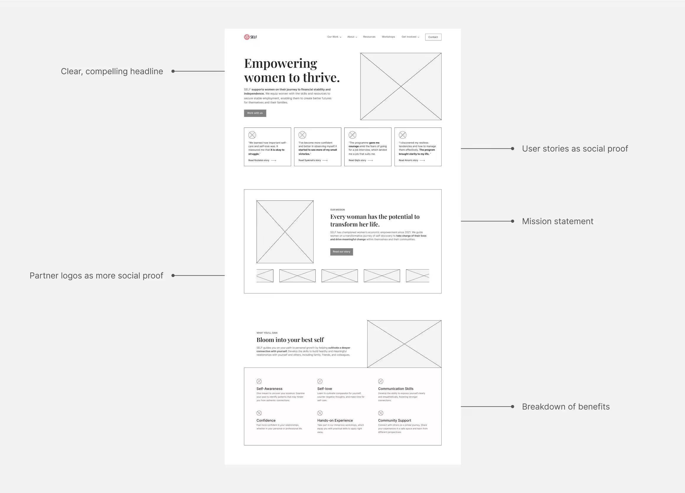
Homepage wireframe
Bringing the Structure to Life
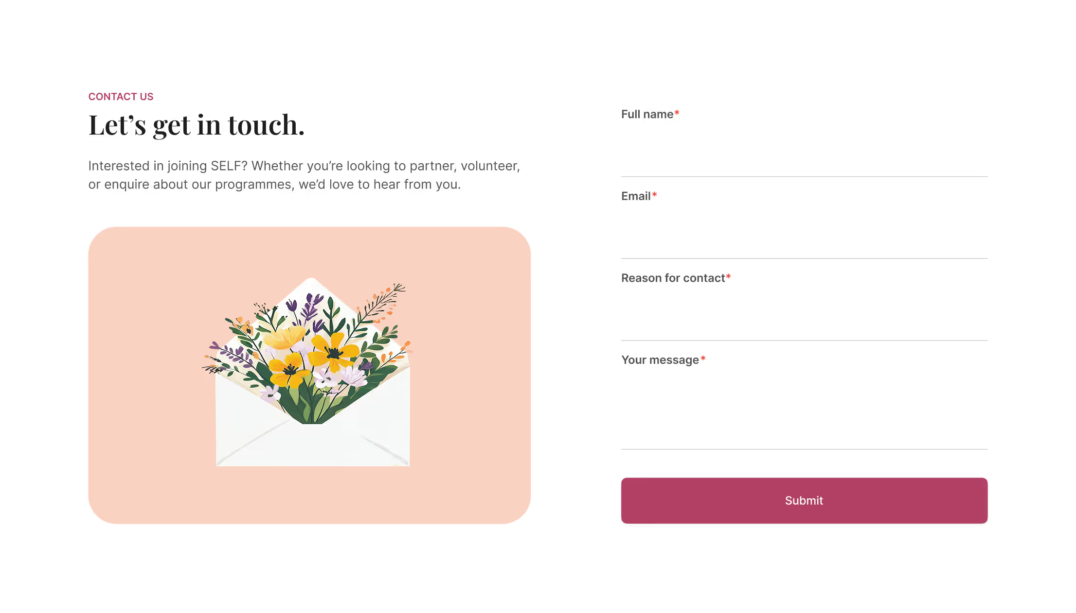
After drafting the website copy, I built simple wireframes to show how the pages and user flow would work. This made it easier to align with the client on structure before starting the visual design.
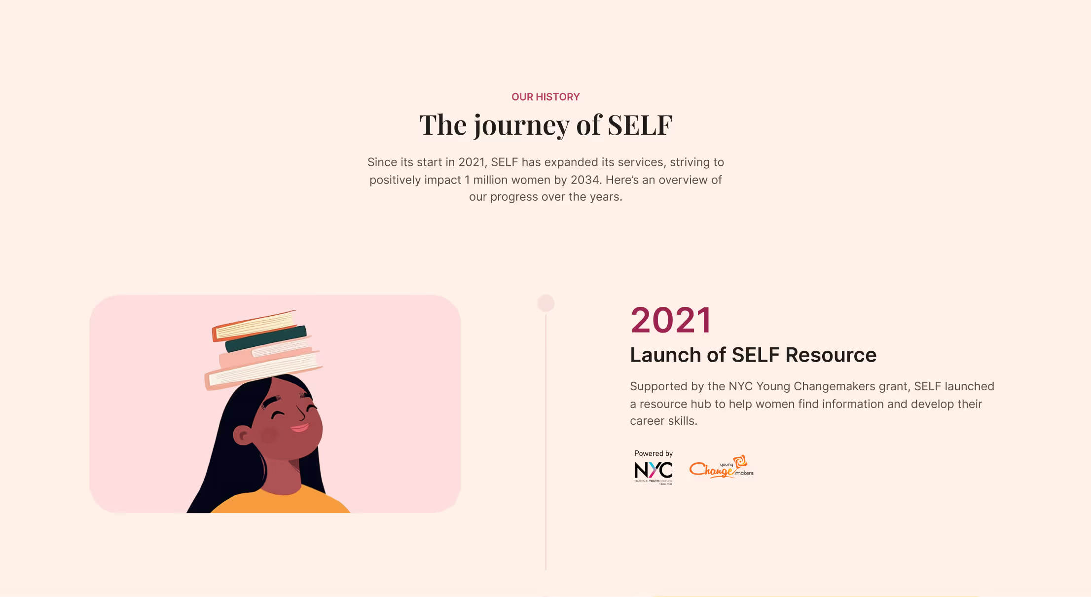
History timeline
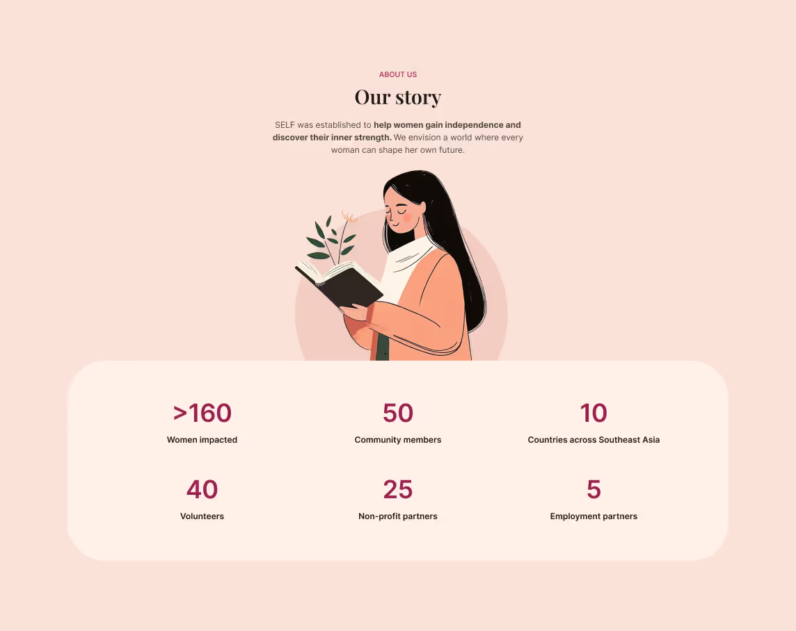
SELF's impact
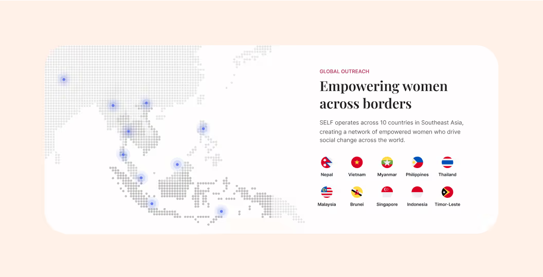
SELF's locations
Telling SELF’s Story
Sharing SELF’s story was key to connecting with potential partners and clients. I highlighted their impact and the problems they address, walked through their solutions, and outlined their journey over time.
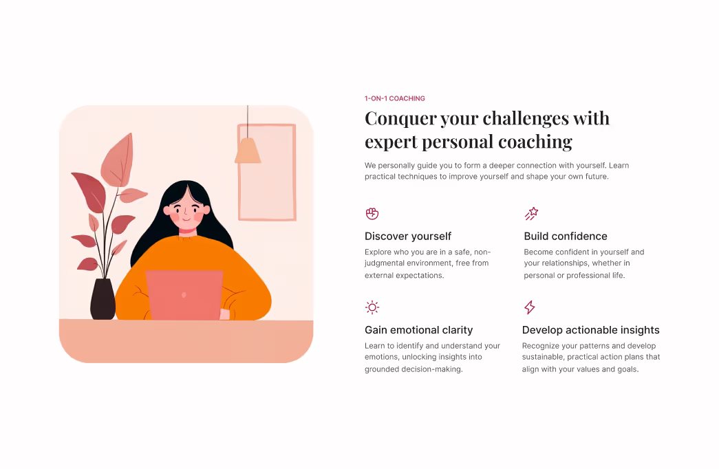

Testing & Iterations
As I laid out the website, I regularly tested my designs with the client and other SELF members to gather feedback and iterate. Key changes include:
Shaping the message
At first, I highlighted practical benefits like “develop job skills.” However, testing showed users cared more about emotional needs, so I updated the messaging to include phrases such as “build confidence” and “gain clarity.”
Making the next step clear
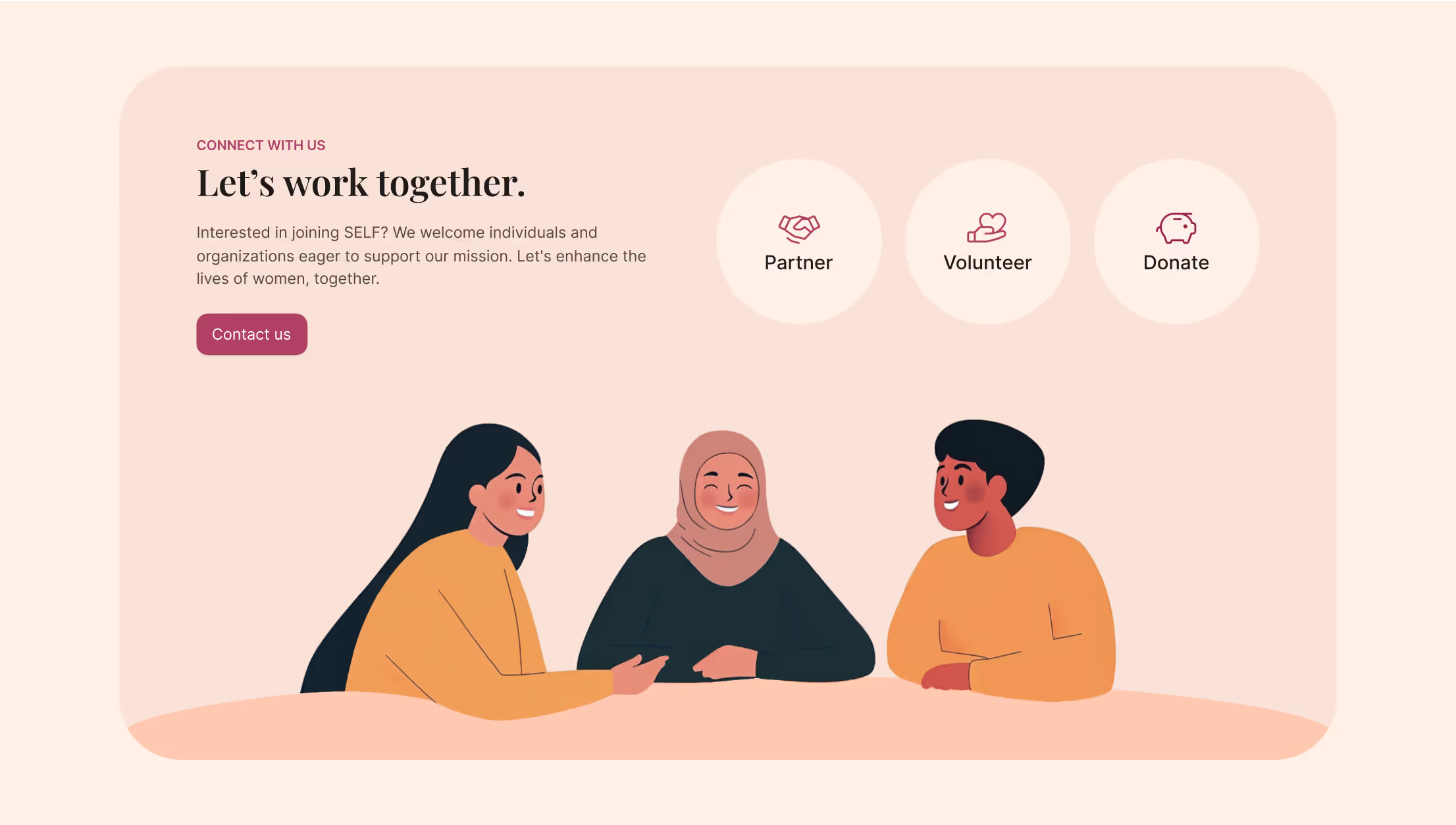
I first designed the CTAs to focus on contacting SELF for collaboration, but testing showed users didn’t realize they could also partner, volunteer, or donate. I added secondary CTAs for each option to make these paths clearer.
Project Impact
With the new site and brand, SELF saw a big boost in leads and engagement. The redesign not only improved their professional image but also helped them connect more meaningfully with their audience.

